
TrainersLab postmortem
 TrainersLab was a Windows application that I created together with a Swedish bodybuilder in 2003. In those days you called it a "Multimedia CD-ROM" to make it sound more fancy.
We parted ways and I continued on my own, redesigned the application and published a new version in 2005, as downloadable on the internet.
I still think the technology I used and style of user interface of this new version is very interesting, and could motivate doing a postmortem description of this dead product.
My very talented friend Erik was kind enough to design the logo and page elements. See above for the stylized TL as in TrainersLab. It was meant to resemble the heart pulse curve of an ECG print.
TrainersLab was part educational material, mostly about gym training and nutrition, and part diary tools to log and analyze your training. The philosophy was "Science doesn't fully understand optimal training yet. Become your own scientist and analyze what you do, to find your optimum path to success."
A trial version of TrainersLab can be downloaded from here. Works on Windows XP, but probably not on Windows 7 and later versions.
Technology
TrainersLab was built in .NET technology with C# 2.0, and a proprietary database format. Data was stored through normal object serialization, and then written as records in a simple flat file database, with a separate index file to keep track of all objects. This resulted in pretty simple but efficient storage of object graphs, and quite the opposite of a sophisticated RDBMS that would have had to be installed on the user machines.
The user interface was mostly done in HTML, which was very unusual at the time, and still is for a Windows application. All content and tools were in document style pages not forms, and organized in a hierarchy of folders.
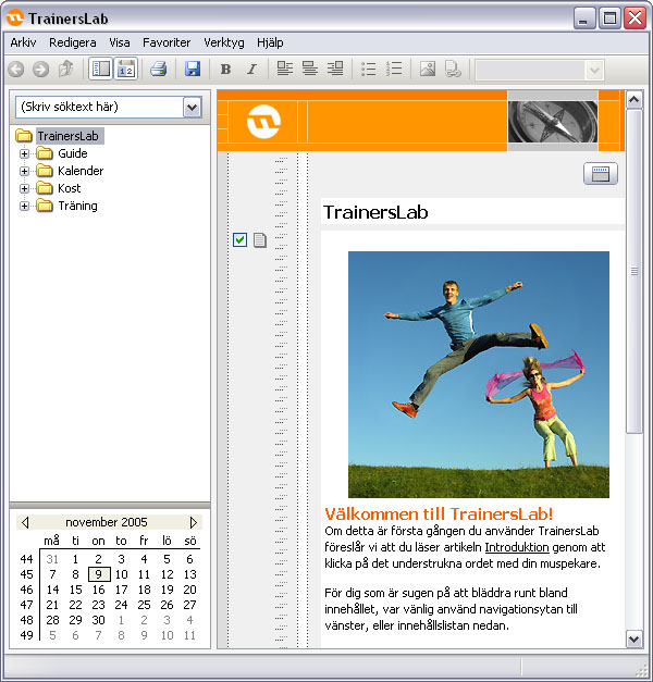
Below: The general design of the application. The folder structure is to the left, the main menu at the top, and the document pane to the right. The document pane was entirely done in HTML with the rest was normal Winform components. (All in Swedish).
I embedded Internet Explorer into the application, and made heavy use of its content edit mode, so that pages could be edited in a true WYSIWYG fashion. Pages could be created and modified both during its production and at the hands of a user.
The structure could be navigated though the left menu, or if it was hidden away, through clicking on links in the text of the pages, and through the breadcrumb navigation at the top of each page. This gave the application a feel of being a web site but at the same time an application, which I felt was a very nice and powerful combination.
For example at the start page above, the user can either browse the directory structure to the left. Or he can click a button above to hide the directory, and then continue browsing around like a web site with underlined links, as shown below.
Below: The page content is in the middle, in this case a folder that lists recipes. At the top is the breadcrumb navigation that shows where in the structure the page is, and below is a list of sub pages/folders. To the left are checkboxes with icons, which optionally show and hide those particular sections.
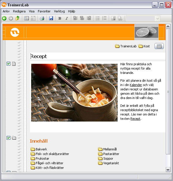
TrainersLab had a huge database of ingredients and their nutritional values. These were combined into recipes, with totals for all the values, so that users could keep track of their diets.
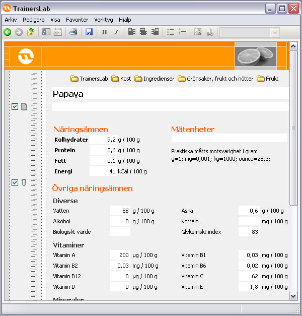
Below: The nutritional values for papaya fruit. These pages are documents, but at the same time editable, in that every white box can be edited by the user.
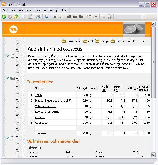
Below: A number of ingredients are combined into a recipe. The editing was all through the magic of dynamic HTML. The text of each ingredient is a clickable link that leads back to its page.
Below: The same logic applies to exercises and how they are combined into training sessions. Every exercise included in the application also had a video sequence of my friend performing it. We filmed it in the gym and then I carefully extracted one single repetition from the feed, so that it could be looped indefinitely without any sign of overlap. As with ingredients having nutritional values, exercises instead had a list of involved muscles.
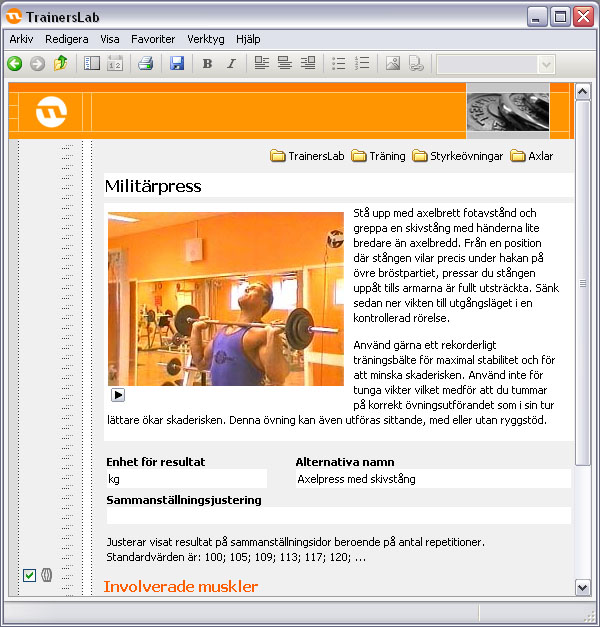
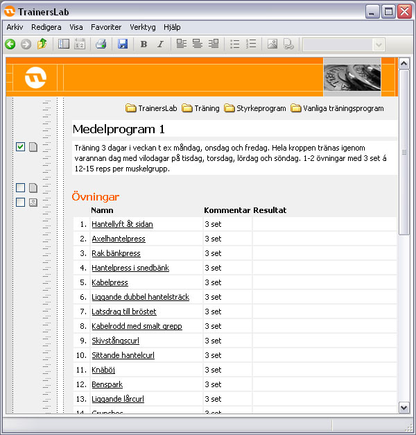
Below: Several exercises are combined into a training session, with space to write your result in the exercise, for example 40 kg done for 12 repetitions.
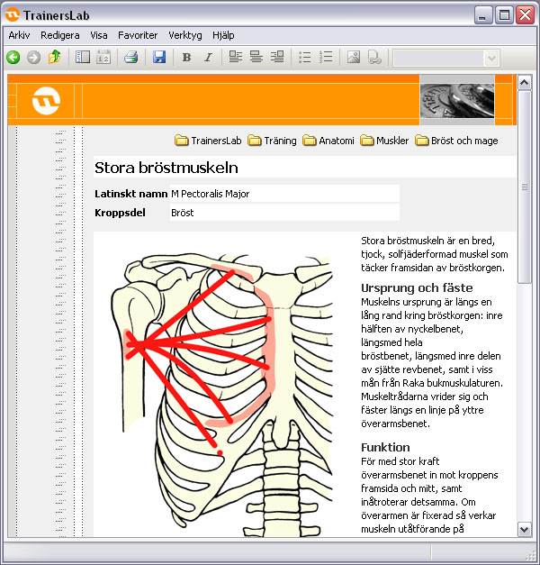
Below: I dug deep into the physiology books and compiled descriptions of all major muscles in the body. In this case the major pectoral muscle.
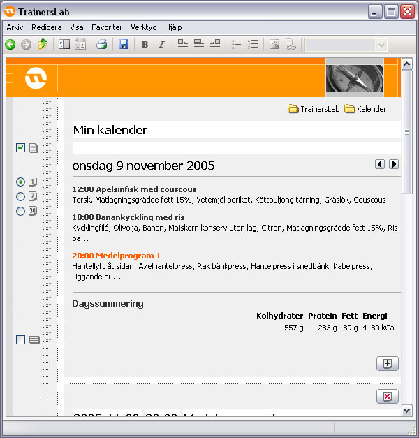
Below: It all came together in the dairy, where all meals and training sessions were logged.
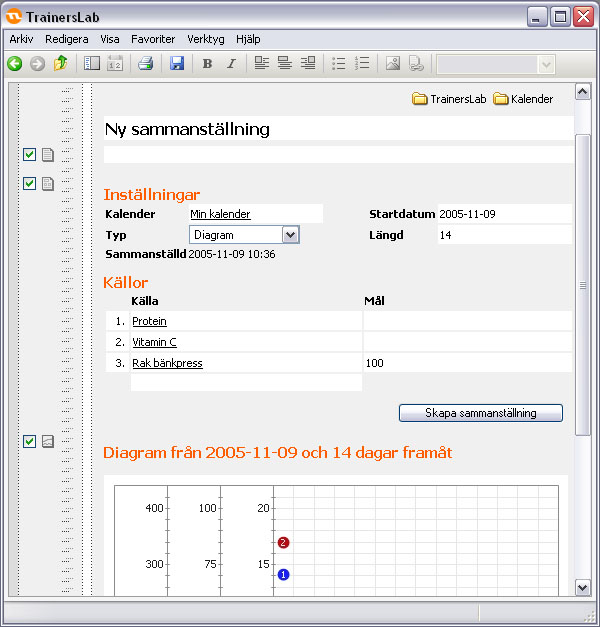
Below: The powerful diagram function took all the logged data and presented it as curves, to analyze progress, and find what things that did not work really well. In the example below three curves are compared: amount of protein consumed, amount of vitamin C consumed, and the result in bench press. (Sorry for not showing the entire diagram, this is the only screen shot I have).
Final thoughts
At the time I thought that combining a document flow layout with an application form layout was a very good thing, and where the future for user interfaces would lie. Forms get increasingly complex and need the flexibility and plasticity of flow layout, while documents usually need buttons and controls to modify their contents.
I still think this is an optimum way to design user interfaces, but few seem to agree, because there are no professional tools to create this kind of design. It has to be done through various tricks, and is very time consuming.
As for the story of TrainersLab, it never caught on. I believe it was a really good product, but I only sold about a hundred copies of it. I think it was a combination of the market not being ready for it, and lack of sales effort on my part. I learned the hard way that I should stick to being an engineer, not a businessman.